Self Project Summer A5 Designs

 The Dark Knight and Toy Story A5 Designs
At the time I was obsessed with the Joker and over the summer I watched it about 3 times, so I decided to do a A5 based on the Joker and I included one of my favorite quotes from the film as well as one of my favorite scenes in which he reveals the Joker card. The A5 on the right was based on the film Toy Story 3 which I watched in summer, I created this by drawing Woody on tracing paper then I created the background as clouds, I did this so that it purposely gives off a sad effect because to me Toy Story was relatively sad. 


 Carribbean Party and Blackpool Bike Ride A5 Designs
The A5 design on the right was based on a Caribbean Themed party I attended in Majorca in summer, I had to wear a dreadlock wig, and later when I saw the picture of me taken I thought this would be a good design if I fused it with Caribbean colours. The design on the opposite side was based on the bike ride I completed from Warrington to Blackpool, I decided to do this in black and white colours because the weather was awful and I had never done anything like this before and it was tiring.


Simples? and Family Tree A5 Design
The idea for the Alexander from Comparethemarket.com ontop of newspaper headings, actually just popped into my head whilst I was having breakfast, I had the paper in my hands and I was reading about 100 people dying in some kind of accident, and then when he said "Simples" at the end of the ad, the idea just appeared. Where as the Family Tree design was based on me trying to show people what the company I worked for, but because my family owns the company I thought it would be a good idea to collage it, personally I feel this was effective, I collaged this using leaflets from my company.


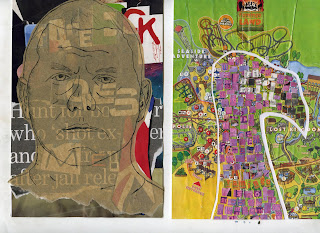
 Raoul Moat and Flamingo Land A5 Design 
Raoul Moat was big news in the summer, and after hearing that he had an appretiation group on Facebook, this inspired me to do a piece on him, originally I was going to do his face on tracing paper then underneath have the words "Facebook loves me" in a 'bloody' type face, but then I thought a collage of basically what he did ie-Newspaper headlines as a background proved more effective. The Flamingo Land design on the right was the first A5 I produced out of my 20, this was quite a simple design I stuck the map of Flamingo Land to a A5 peice of card, and then I coloured pieces of the squares I cut out from another leaflet, painted them pink, black, and white, then I stuck them down using a mosaic style. 


Influences Project A5 Designs

 "Hendrix Experience" Milton Glaser Influences piece
This piece was influenced by Milton Glasers 'Dylan design' and I had to replicate this design but using my own style. So I researched various famous music artists from oldies to modern, the three I focused on whre Lady Gaga, Nirvana, and Jimi Hendrix. It was obvious that Nirvana's Kurt Cobain would be hard to replicate in this kind of design, because he does not really have any particular facial features which would really make him stand out in shadow form. Where as Jimi Hendrix and Lady Gaga have distinctive features, if I did lady Gaga I would have focused on the thunder mark on her face used on the poker face video, but in the end I decided to choose the Hendrix design because all the colours alongside the words "Hendrix Experience" I felt this would create a good design.
 

"Fu*k this I'm off to Hogwarts" Jamie Reid Influenced piece
This piece was based on Jamie Reid's "Never Mind The Bollocks" design, but to make this piece more of my own I changed the colours and used newspaper text for the words, also I used the words "Fu*k this I'm off to Hogwarts" which I saw first hand on a placard during the student demonstration in Manchester.


"Love and Other Drugs Poster Design" Saul Bass Influenced piece
I wanted to create a poster that really focused on Saul Bass's 'The Man with a Golden Arm' design. So I looked though various movies that could support this kind of style with the hands, one of my ideas was to use the up-coming film Kung Fu Panda 2 as my design where I would have a basic outline of the panda and then have him holding chop sticks and reaching out for the number 2. However, in the end I decided to choose Love and Other Drugs because it had an easy to follow colour scheme, and the idea of hands symbolising addiction as well as love could prove to be a powerful image.


Development (Preliminary Work)

Development page from the 'Self' project
For the "Self" project I had to create a book cover design for a book called "The Many Facets of Self", the design would be created useing the 20xA5 peices I created over summer which were based on my own personal summer activites. I then collected artist research on artsts such as Jime Dine and Keith Haring, and then I began designing by creating some thumbnails, then from the designs I took them into further development work, then from here we created a final draft, and eventually a final design. This page is where I came up with the figure which I used for my final peice, it was created useing a Keith Haring figure and the eye from one of my A5 Summer Preoject designs, I then experimented with media  and decided to keep it exactly as it was, but as a final design I produced it on note paper and changed the type around it to something more personal.

Sketchbook Work

Sketchbook Front Cover
This is my sketchbook front cover, here I did a collage using some basic matierals such as masking tape and note paper, and the 'fist in the air' idea image was taken from a game called Bioshock. I like the simple design I have used here I think the black background is what makes the image stand out.


 Keith Haring Artist Research
This is one of my pages featuring one of my favorite designers Keith Haring, the reason I admire him and his work is the simplicity of the designs, and how effective they are, in fact it was his style that influenced me and helped me in the 'Self' project.


 Keith Haring Influenced Piece
On the opposite page I reproduced some of his works in my own style, I created the one eyed figure as part of the 'Self' project, the biggest influence was Keith Haring, but he wasn't the only influence, I used some of the designs I produced over summer to help me.


Jasper Johns Influenced Piece
This piece was produced in the style of Jasper Johns however, once again I wanted to introduce my own style and media expoloration into it, so rather than just copying his piece, I wanted to try collage as the background then roughly painting the flag on top.


 'Yes/No' comic strip
This piece was a part of my 'Collections' project, in which we had to bring in some of own memorbillia then use them to create some designs. In this case I brought in an 8 ball, and I thought it would be interesting to create a simple comic strip around it, I used coloured fine writers and wash on this piece.


'Look After Yourself' Collage 
This piece was created using the Design Council magazine, and because of the images within the magazine it creates an interesting collage, I called it 'Look after yourself' after most of the images in the magazine were of love and other elements of 'Self', which tied in completely with the 'Self' project.


Jim Dine Influenced Piece
Jim Dine had a slight obsession with Pinocchio, and so I had to choose someone or something I was obsessed with as a basis for the design. At the time it was the Joker, and I wanted to replicate a piece using the Joker but in a Jim Dine style. I drew the Joker, and then I had to decide on what words or quote I would use to surround him, I printed out a list of all his best quotes but in the end I decided the symbol of the Joker is the traditional "Hahaha", and then as a final touch to really get the Jim Dine style, I burned the edges of the pages.